Alright, here we go.
Another week done on Echo Terminal. I didn’t get quite as much done this week, and I blame Resident Evil 2! I’ve been so excited to play it that I lost most of the weekend to it, and my dev time took a hit. But! I still made a good amount of progress and I’m not falling behind, so it’s fine. Taking a break sometimes is good for your health anyway.
Last week I said that my goals were two things. Make some environment art for each of the 4 main areas of the facility, and to revisit and start finalising my level designs. I managed to get all of the artwork that I needed created, but I’ve not spent any time with the levels, other than a very high level plan. It is going to be a difficult process to achieve what I want to with the design, so I was probably over optimistic attempting to tackle both.
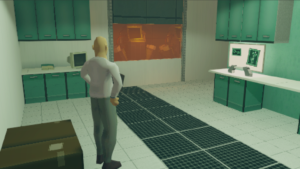
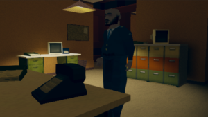
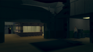
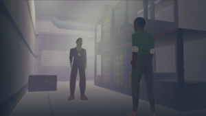
Here is some of the new artwork. The idea here isn’t to worry too much about specific props, as I’m sure I will need a bunch of those, but I won’t know until I finalise the level designs. What I really want to do is define the look and feel for each area.
The most important things to identify when doing this are things like colour scheme and lighting, which I will go into a bit more detail on below. Remember that in Echo Terminal, these locations will mainly be explored though the terminal itself, so small details will mostly be lost. That is part of the reason why the feel of a location is so important

The Lab. Clean, bright and medical green, with a hint of orange to indicate hazardous equipment or samples. It might not stay so bright and sterile for the whole game, but the purpose of this area is very easy to understand, even with very minimal props.

Admin. Warm, dusty and due an upgrade. I used a 70s colour scheme here to emphasise that this isn’t an important area of the facility, in stark contract to the super modern look of the lab with it’s unknown technology. This is also the area that visitors would come to, on the ground floor, so maybe downplaying how modern the facility is underground is a conscious decision by the people who control the building?

The basement. Dark, grey and industrial. You will have seen this shot before, as this is where the security booth is. Down here you should expect lots of pipes, machinery and generators. Everything to keep the lab running behind the scenes. It isn’t clean, but it doesn’t need to be. It looks like somewhere that it would be easy to get lost.

Cold storage. Foggy and cold, not somewhere you want to be for very long. Full of samples and anything that the lab might need for their experiments.
The fog is interesting here as it can have gameplay implications, but merges well with the environment in a way that it wouldn’t if I wanted to use mechanics related to the fog in the admin rooms, for example. That sort of thing has a huge impact on the level progression, and in turn the story. Personally, I think games have to be made that way, with each part influencing each other, which means that it can’t be locked down until all of the elements are in place.
Over the next week, I will be focusing on level design. It is going to take me more than a week to get them finished, but I would like to have the flow and overall journey through the game set in stone, with a few areas simplified that I can revisit later on if I get time. I’ll probably get bored though and I won’t have anything to show either, so I might do some more artwork, or start putting artwork into the levels that I have managed to finalise. Once that is done I should have a fully playable game, which is exciting!